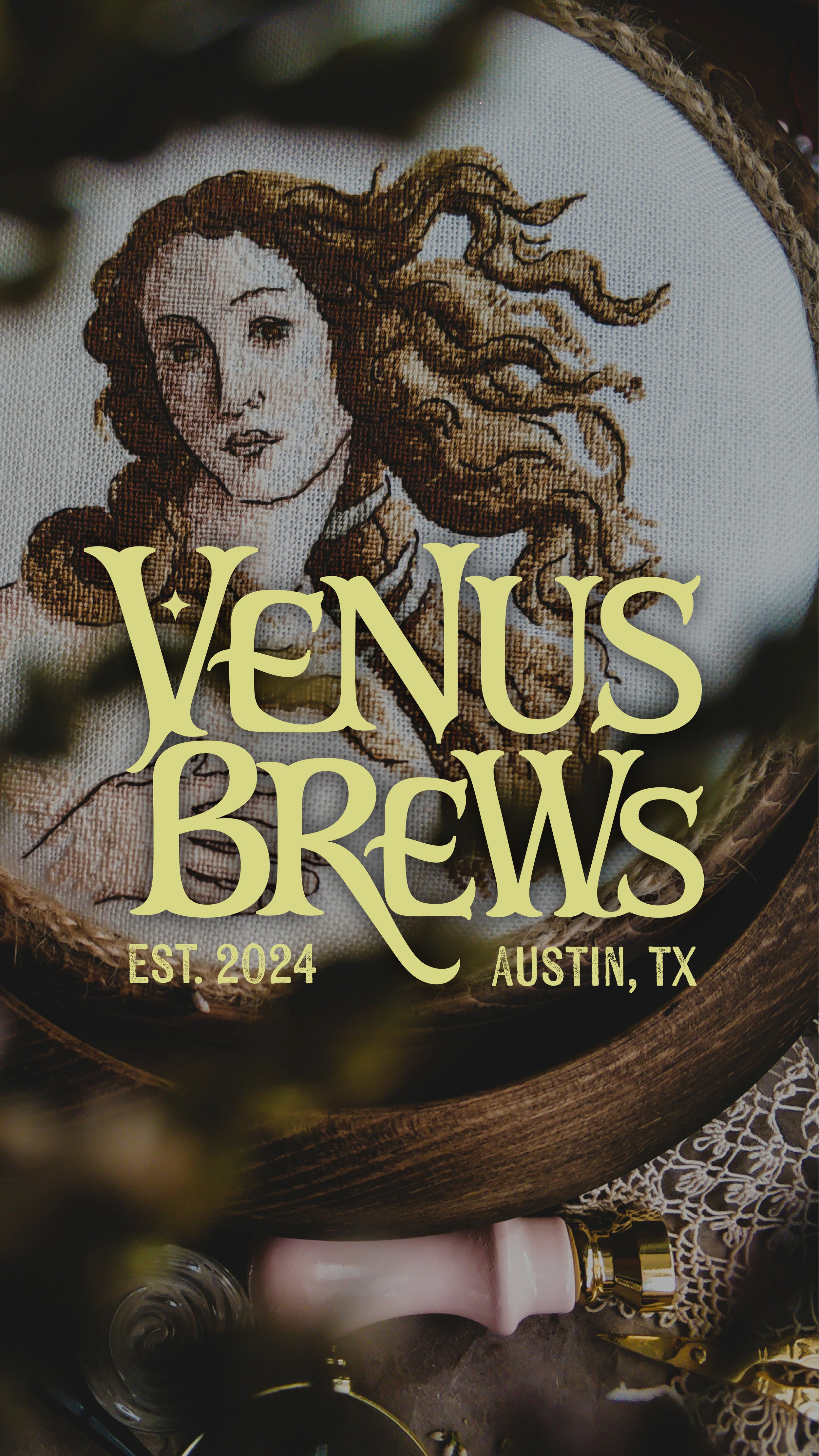
Venus Brews
Venus Brews is a concept brand for a beer company based in Austin, TX. Drawing inspiration from the goddess Venus, the essence of Venus Brews transcends mere beer; it embodies values of sisterhood, empowerment, and the creation of unforgettable memories.
Brand Positioning
Target Audience:
Age: 21-35 years old
Location: Austin, TX
Interests and hobbies: Dancing, drinking, & lots of laughter
Values: Confidence, friendship, empowerment, creating incredible memories
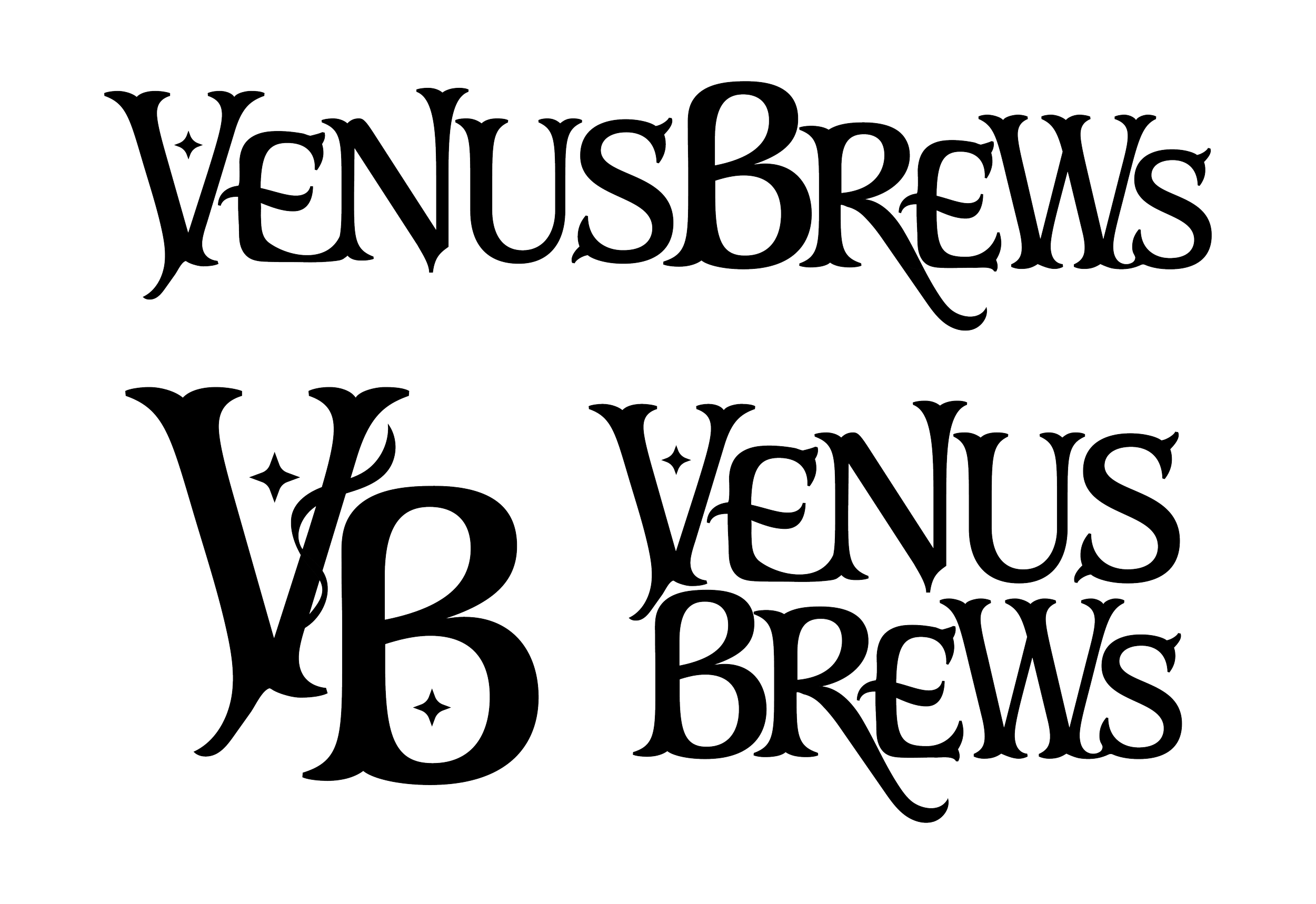
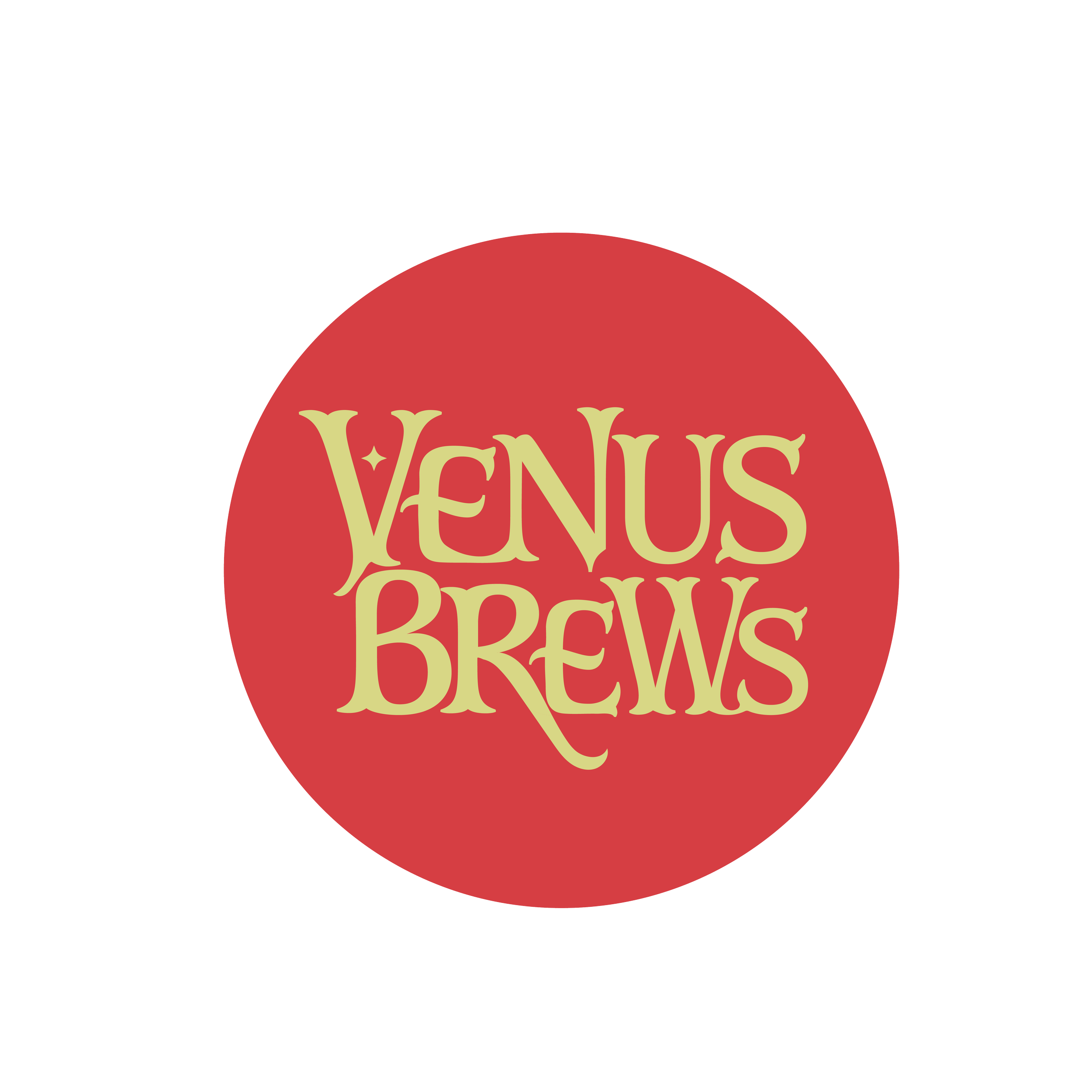
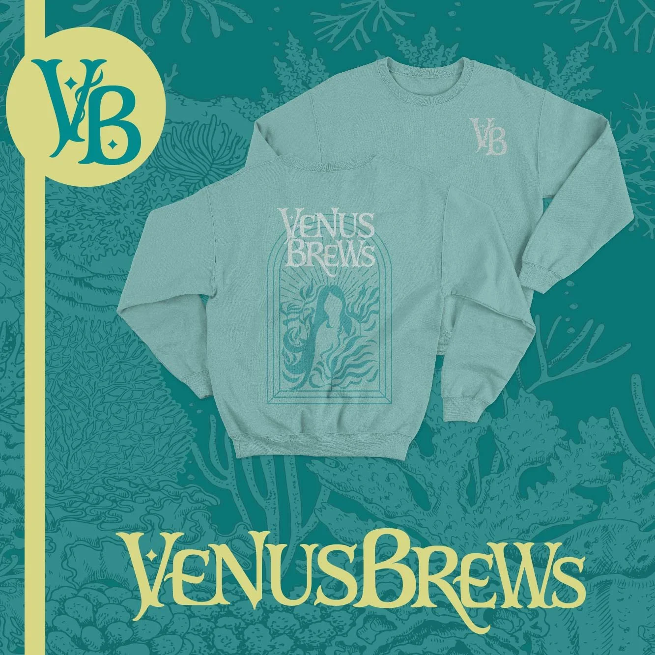
The custom word-mark logo combines flowing, organic curves, creating visual rhythm that embodies Venus's regal essence while strategically positioning the brand as an empowering, premium alternative in the traditionally masculine beer market.
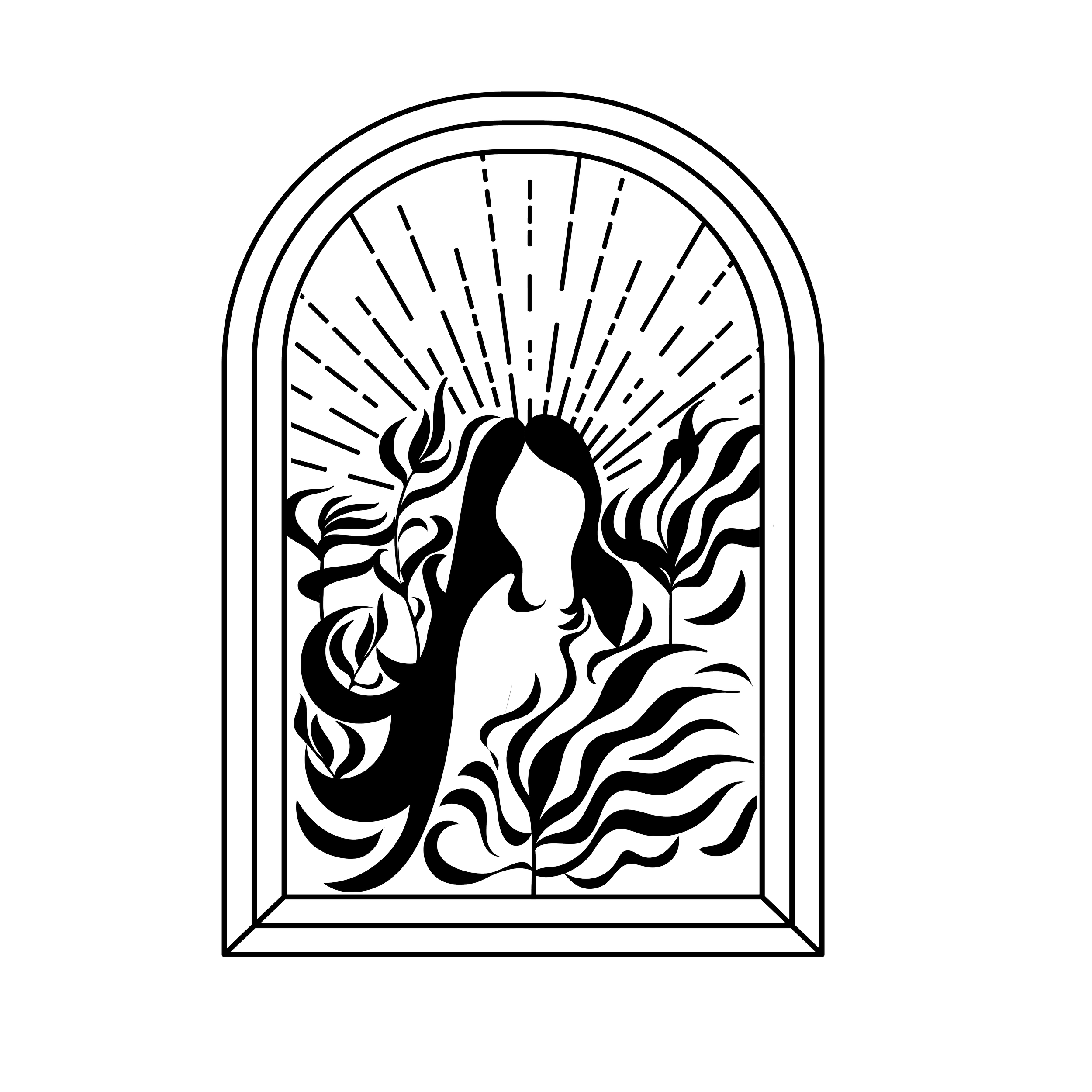
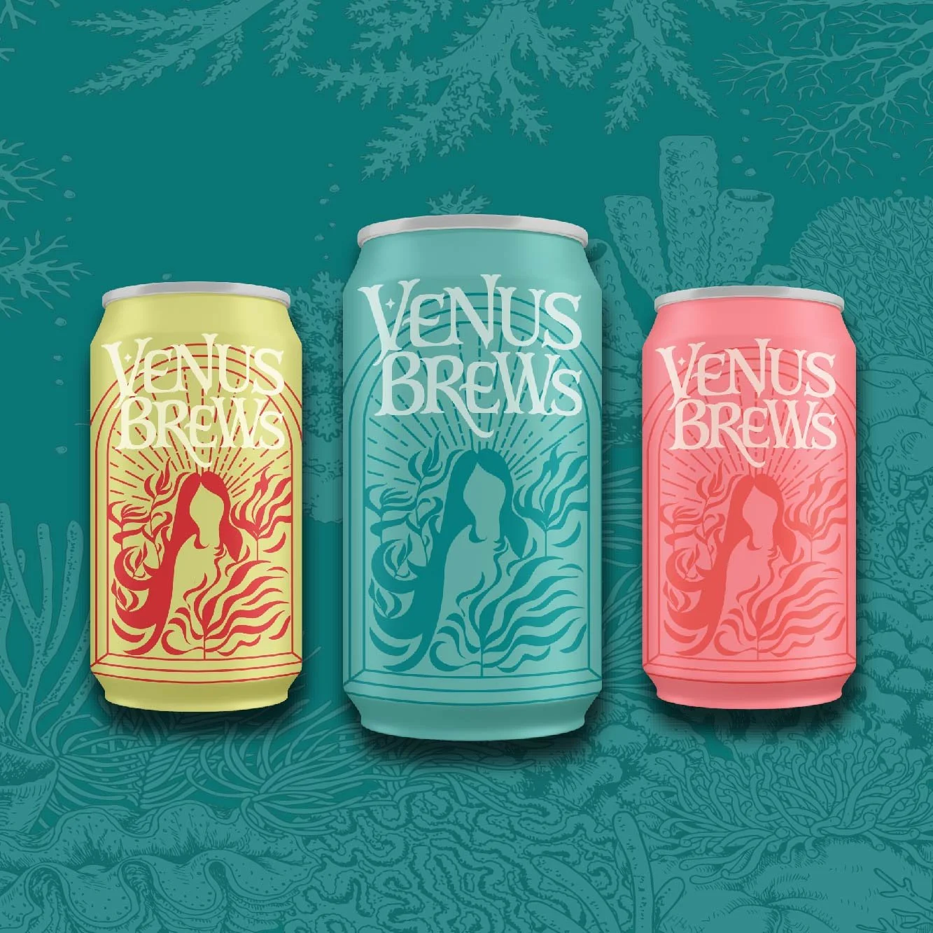
The illustration created in adobe illustrator for the package design depicts the silhouette of Venus, the divine goddess, emerging from the ocean amidst seaweed. Her flowing hair seamlessly intertwines with the seaweed, imparting a sense of fluidity and femininity to the design.